
David Abisagboola — Motion & Graphic Designer
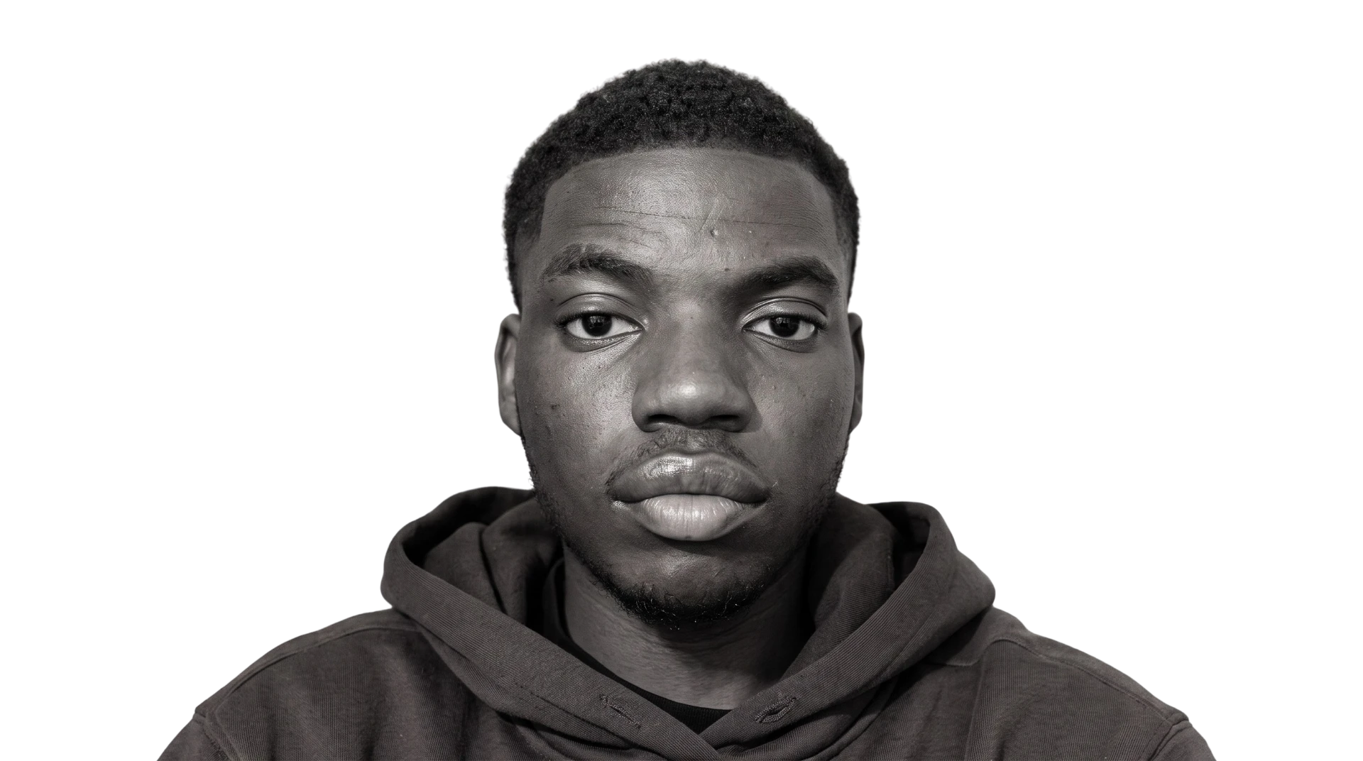
David Abisagboola — Motion & Graphic Designer
About
Ideas built into bold, moving visual systems.
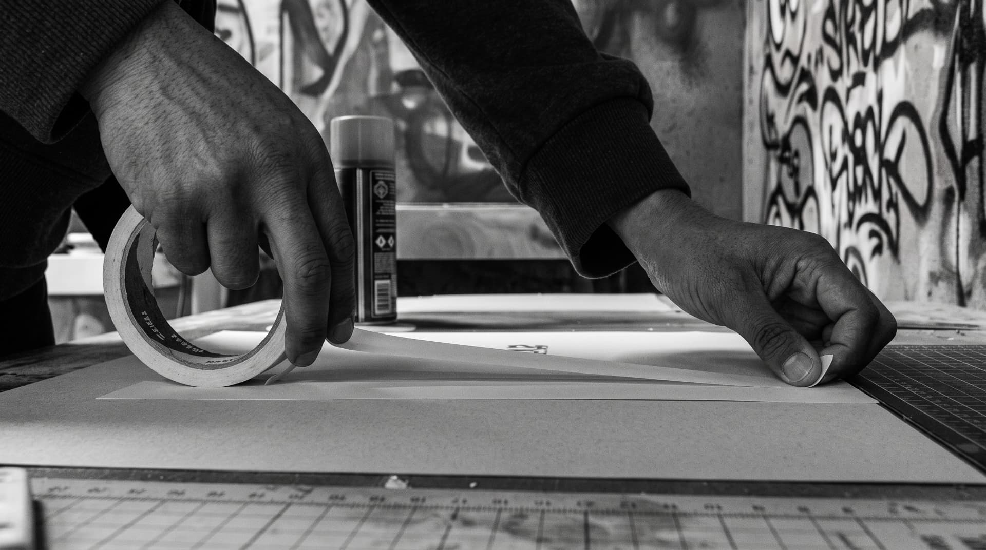
I'm a graphic and motion designer who enjoys turning ideas into bold, engaging visuals. With experience across branding, digital design, and marketing, I work with Adobe Illustrator, InDesign, Photoshop, After Effects, and Figma.
Through my studies at the University of Central Lancashire, my placement at Vivid Manchester, and my internship at DEPT®, I've developed my creative skills while learning to collaborate, adapt, and bring ideas to life in fast-paced creative environments.
Outside of my professional work, I volunteer at my church as a designer and livestream operator, creating graphic and motion assets while using vMix and OBS to manage live broadcasts.
I'm always looking to experiment, learn, and create work that makes an impact.
Turo
BRAND MOTION — EXPLAINER, UI, MOTION STUDY
A flat, confident motion package built around one idea: rental, reinvented. Bold type reveals, a single purple accent, and clean snap transitions carried from the brand still into product and web.
Credit
Produced at DEPT® under the direction and supervision of the Turo team. The concept and brand are not mine — the pieces shown here are the motion work I designed and animated within that framework. All brand ideas, assets, and copyrights belong to Turo.
Web explainer
A conceptual walkthrough of how renting should feel
Ad motion
The pitch,
not the
product
Ad motion designed to pitch a host's dashboard: sequential card reveals — profile, trust, activity, earnings — purple as the single accent colour, paced for persuasion, not built as functioning UI.
Turo — Motion study
Colour wipe transition
A reusable transition built to move between two brand colours without a cut — the frame is carried across by a single sweeping shape rather than a fade.
It is designed as a broadcast and social utility: swap the two colours and the same timing works for lower thirds, promo stings, or section changes on a site.
Rendered short and light so it can loop endlessly at small file size, with the easing weighted to the middle of the wipe for a confident snap.
UMOJA
City identity — Three tribes, one city
The brief came from Continuous, an agency via UCLAN — to design and build the complete branding of a fictional city. From the name and its meaning to the symbol system, voice, signage, and campaign, every piece of City of Umoja was created from scratch as a place that exists only in design.
01 / Problem
Division threatens progress.
Rising tribalism in Nigeria is deepening divides among the Hausa, Yoruba, and Igbo — threatening unity and progress.
02 / Insight
Loyalty can become a fault line.
Tribalism in Nigeria, driven by loyalty to the Hausa-Fulani, Yoruba, and Igbo — over 60% of the population — fuels political bias and weakens national unity.
03 / Solution
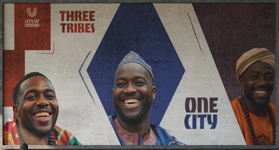
Three tribes. One city.
Members of Nigeria's three major tribes united to build a community of harmony and inclusion — City of Umoja.
People / Out of home
Three tribes, one city — on the street.
Symbols from cloth
SCROLL FOR UNITY
Hausa-Fulani
Yoruba
Igbo
Place / Nigeria, Africa
Umoja means unity.
A fictional city concept where shared culture is not flattened — it is given room to meet, overlap, and build something new.
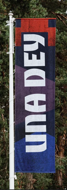
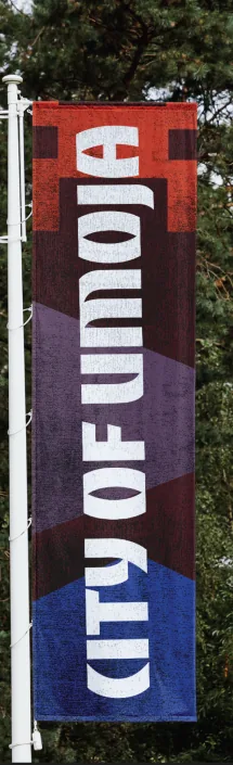
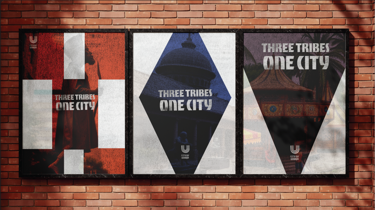
Identity in the city
One identity, built to travel.
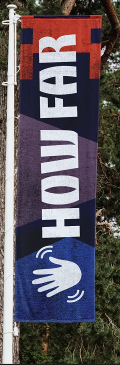
The visual language was designed as a working city system, not only a logo. Its U stamp, tribal symbols, colours, and voice stay recognisable as they move from public communication into everyday objects and civic information.
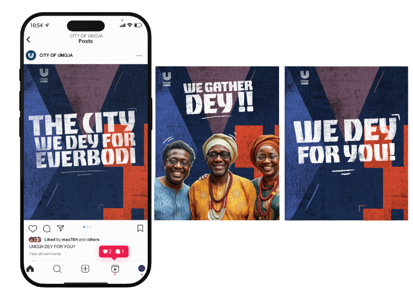
Voice and communication
A city that speaks like its people.
Pidgin gives the campaign an immediate, familiar voice. Repeated forms and colours connect every message while allowing photography and language to carry warmth and personality.

Civic identity
Identity people can trust.
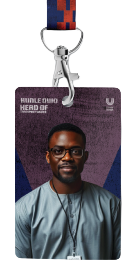
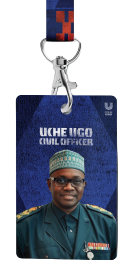
The staff cards carry the city system into daily public service. Role, portrait, pattern, and colour work together to make every official immediately identifiable while giving each department its own place within one shared identity.
Belonging and recognition
Symbols people can carry.
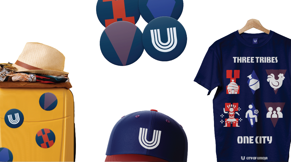
The modular marks turn the identity into a shared badge of place. On clothing, pins, travel objects, and uniforms, they create a flexible system for recognition without losing the central idea of unity.
Information and signage
A system for finding your way.
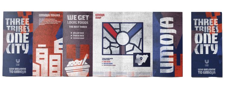
The pamphlet shows how the same geometry becomes civic information: map structure, directional rhythm, landmarks, and visitor guidance. It extends the branding into signage and wayfinding so the fictional city feels coherent and navigable.
Three tribes
one city
TRM
Church motion system — live service visuals
An atmospheric motion kit for live worship: spiralling projection backgrounds in six colour registers, a dimensional logo beat, and broadcast furniture for services.
Moving backgrounds — eight styles
Scroll to see all
Slow, looping spirals and preacher backgrounds built for live service projection. Atmosphere, never attention.
3D logo
Lower thirds
Broadcast information, held in motion.
Message titles and service details share one restrained on-air language, keyed over live footage so information arrives without interrupting the room.
Service intros
Full-screen openers shift the room from anticipation into service, using the same frame, typography and atmospheric pace across Friday and Sunday.
Service announcements
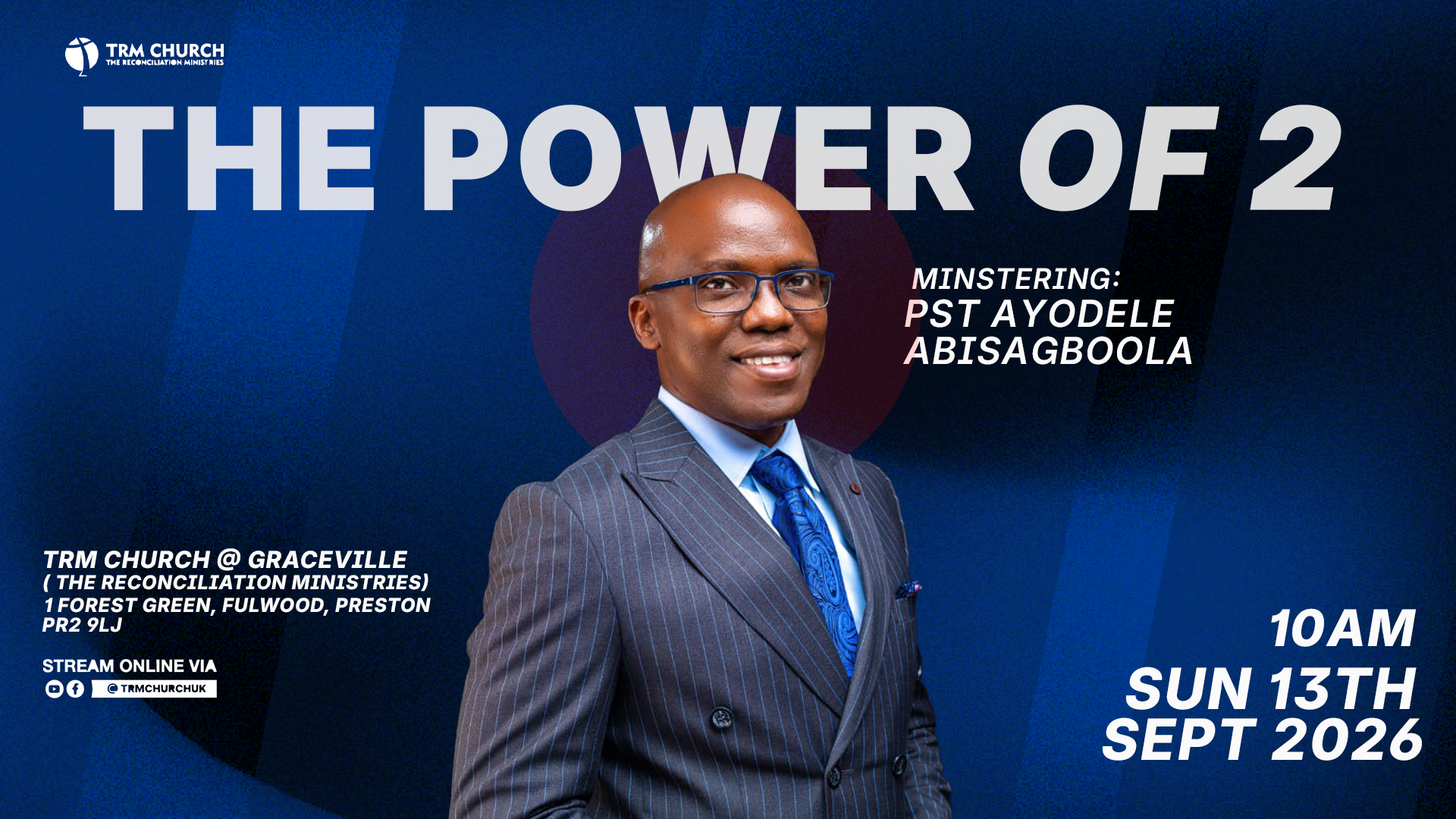
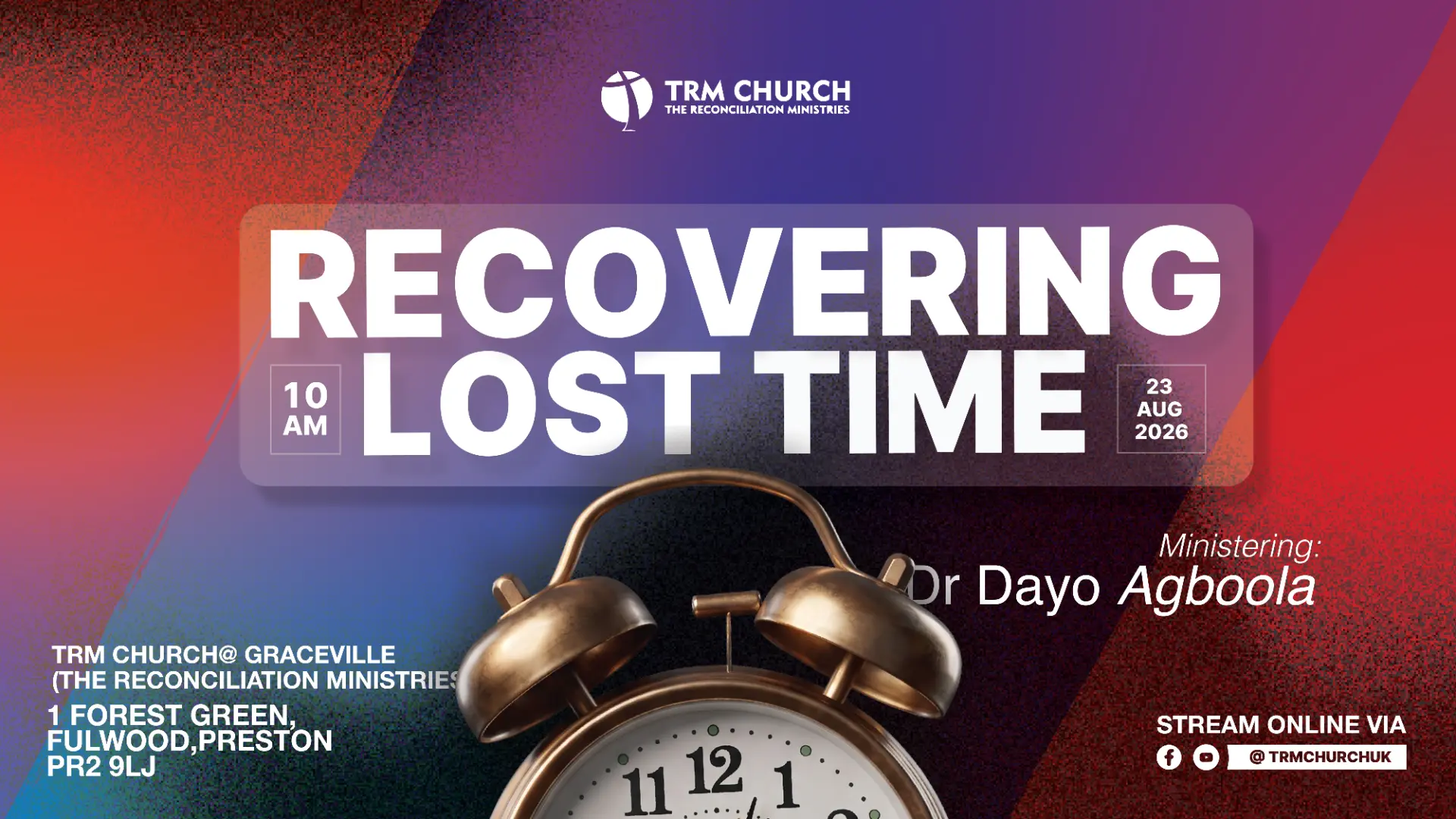
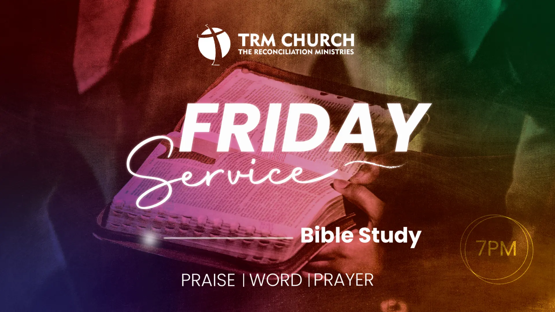
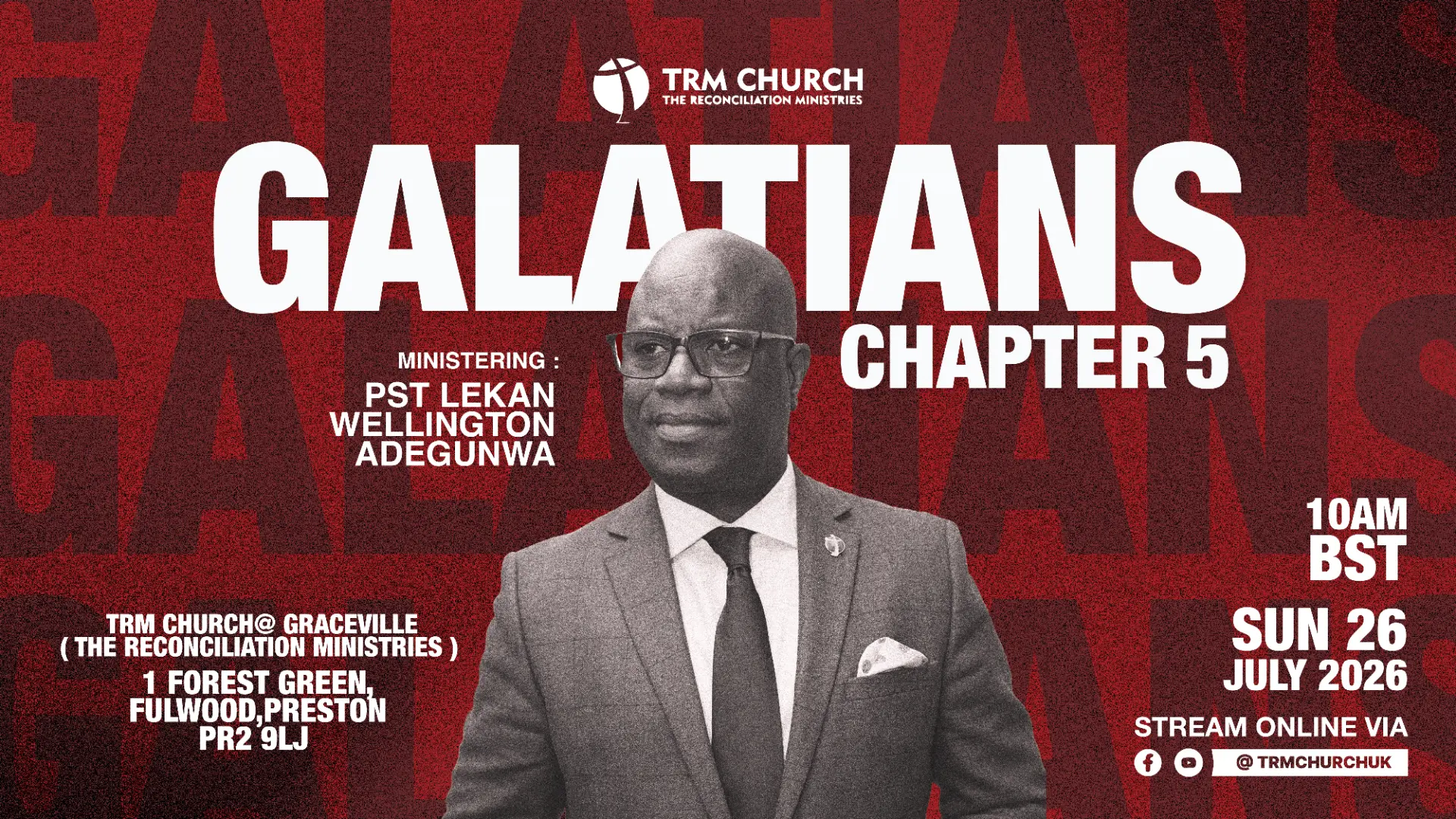
One voice across every invitation.
A flexible poster language keeps weekly services, sermon series and guest moments recognisably TRM through grain, bold type and tightly controlled colour.
Welcome motion
A sound-on arrival for the room.
A full-screen welcome moment gives the service a clear start, carrying the TRM atmosphere before titles and lower thirds take over.
Coming soon
More projects to be uploaded soon
Contact
Contact me for further information.
© 2026 David Abisagboola — Motion & Graphic Designer